
Handling Text Length Differences in Button Design
Tagalog tends to be longer than English. We show practical techniques for keeping buttons aligned when translations expand by 30-50% without breaking your layout.
Read MoreBuilding dual-language interfaces that work for everyone
Creating seamless experiences across English and Filipino — from menu structures to language toggles. We explore practical solutions for text length differences, consistent alignment, and intuitive design patterns that serve both local and international audiences in the Philippine business landscape.
Tagalog tends to be longer than English. We show practical techniques for keeping buttons aligned when translations expand by 30-50% without breaking your layout.
Read More
A toggle that doesn’t clutter the interface. We break down placement strategies, icon choices, and animations that make language switching feel natural.
Read More
Same menu hierarchy, different text widths. Learn how to maintain visual consistency when your dropdown items grow or shrink between English and Tagalog versions.
Read More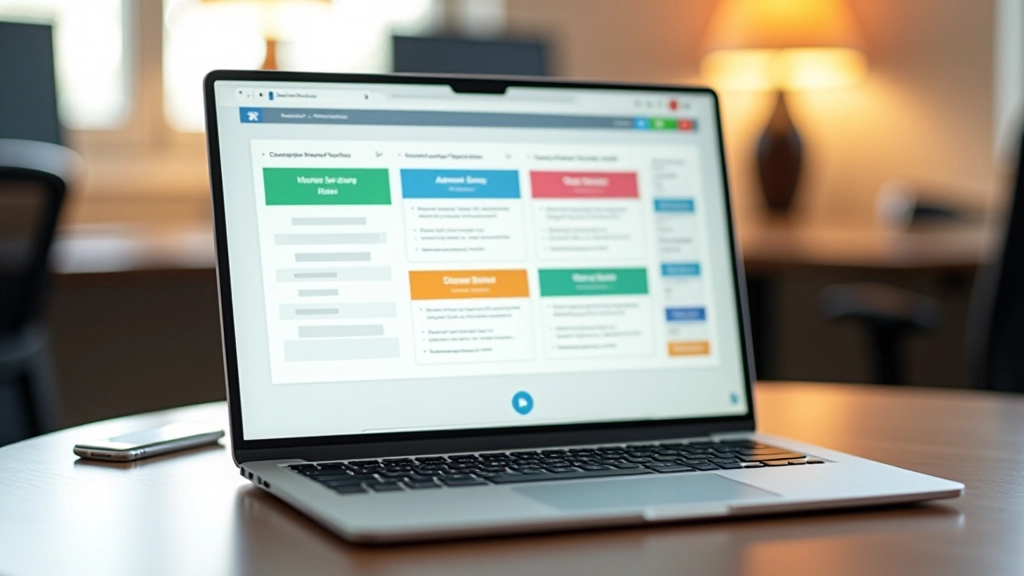
Headers need to work across devices and languages. We explore flexible grid systems, text wrapping strategies, and responsive type scales that accommodate both English and Filipino without sacrificing readability or design intent.
Read MoreWhat matters when building for bilingual audiences
Budget extra width for navigation items and buttons. Filipino text typically runs 20-50% longer than English. Build flexibility into your layouts from day one.
Left-align dropdown menus work better than center alignment when text lengths vary. Line-height matters too — give bilingual text room to breathe.
Language switchers work best in the top-right corner or footer. Keep it simple — avoid dropdown menus for language selection. One click should be enough.
It’s not just translation — it’s thoughtful design that anticipates text variation. The best bilingual interfaces feel native in both languages because they were designed with both languages in mind from the start, not retrofitted afterward.